In this blog post we will break down some key interior design principles based on color theory.
We hope our examples will help illustrate how colors function before you start the process of painting your kitchen.
What are Complementary Colors in Interior Design?
If you were to look at a color wheel, you would find that every color has a complementary color which appears on the opposite side of the wheel. Complementary colors are also known as contrasting colors and indicate a strong difference between two colors, shades, or tones. While these colors are meant to go together, they match in a bold and dramatic way – such as the colors red and green. Color Theory is a widely used concept in interior design. One important rule to follow when using complementary colors is that they cannot be used in equal amounts in the space, because the two colors will fight for your attention and cancel each other out.
Cohesive, Yet Eye Catching Color Pairing
One important rule to follow when using complementary colors is that they cannot be used in equal amounts in the space, because the two colors will fight for your attention and cancel each other out.
To build on this rule – We caution you against painting your walls a bold color (such as green) and pairing it with cabinets in its complementary color (red). It is visually confusing to the eye, and you won’t know where to look first, making the colors clash, and thus canceling each other out.
Well executed complementary color schemes on the other hand are created by painting your walls one color, and then using its complementary color in accent pieces throughout the rest of your space.
In theory, you could create a complementary color scheme with contrasting, bright and bold colors but we do not see it often in our kitchen renovation projects.
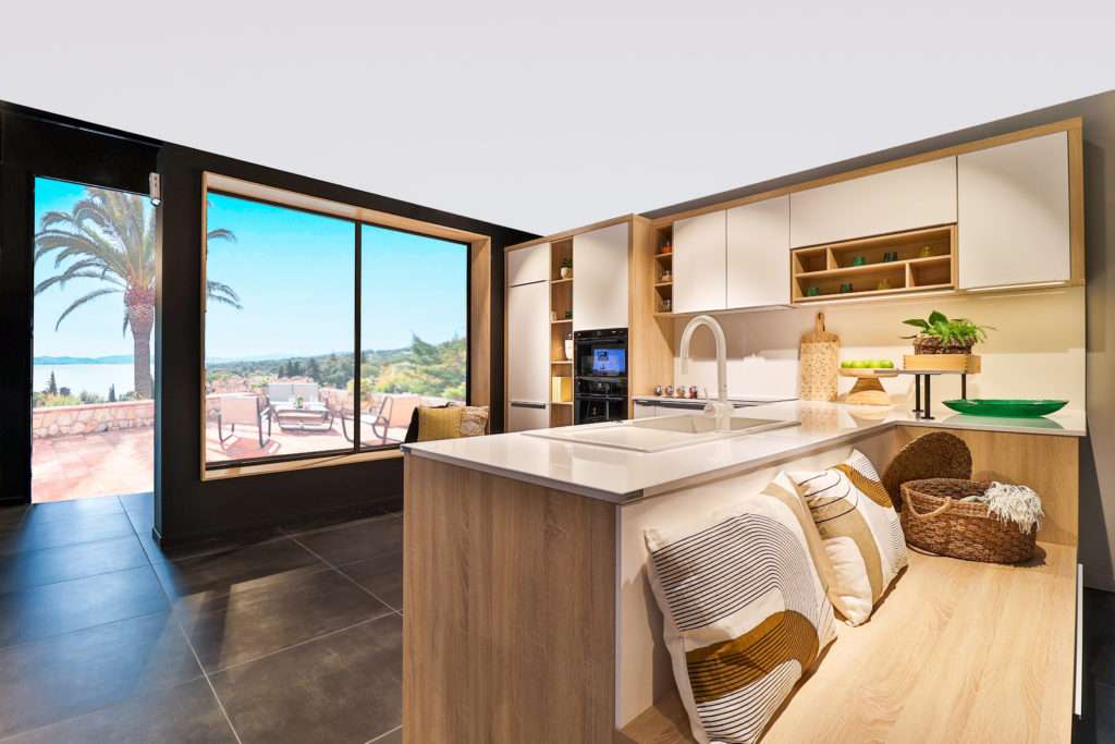
Instead, we recommend taking a less dramatic approach to complementary color pairing to our clients. The combination of black and white by far the most popular choice in modern kitchen designs. For example, try pairing bright white cabinets with a bright white paint color. Then add dimension by opting for bold black accents in your backsplash, chairs, light fixtures, and hardware. You can even add a matching patterned rug or experiment with small pops of color.
Sleek & Cohesive Minimalistic Kitchen
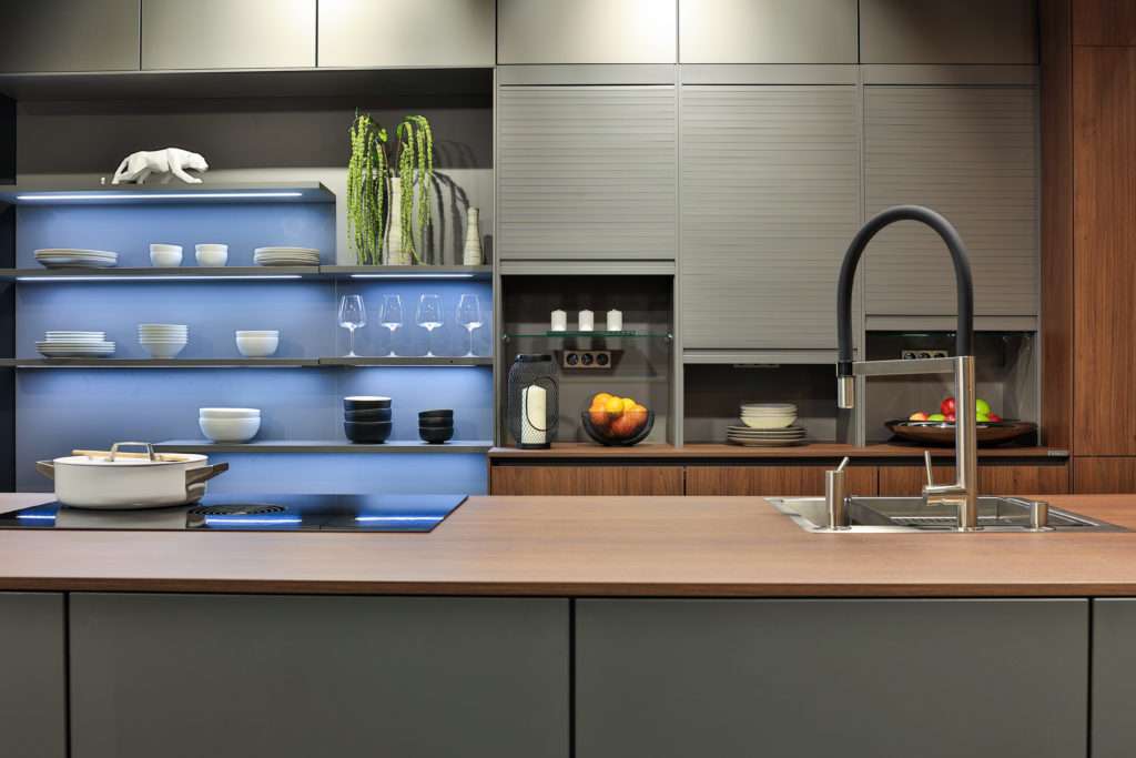
This sleek, modern kitchen follows a less dramatic complementary color scheme, which gives you the opportunity to play with pops of color or bold art prints.
What are Analogous Colors in Interior Design?
Another concept that is frequently utilized in interior design is analogous colors, which is also derived from Color Theory. On a color wheel analogous colors will appear next to each other such as red, red-orange, and orange. Analogous colors tend to be aesthetically pleasing, and is a less intense approach to color pairing when compared to complementary color pairing.
60 – 30 – 10 Rule
Many designers utilize the 60 – 30 -10 rule. Where 60% of your space is a base color (for your walls, and large furniture) , 30% as an accent color (through accent chairs, and area rugs) , and 10% as pops of color (in art pieces or other decorum).
We highly suggest that you follow this rule if you are not using a neutral color palette, as this rule helps to create synergy between all the colors present in your space.
What are Monochromatic Colors in Interior Design?
If you are still hesitant to use pops of color throughout the kitchen, a monochromatic color palette is your safest option. timeless kitchen design. Color Theory defines a monochromatic color scheme as picking three different tones or shades in one color family.
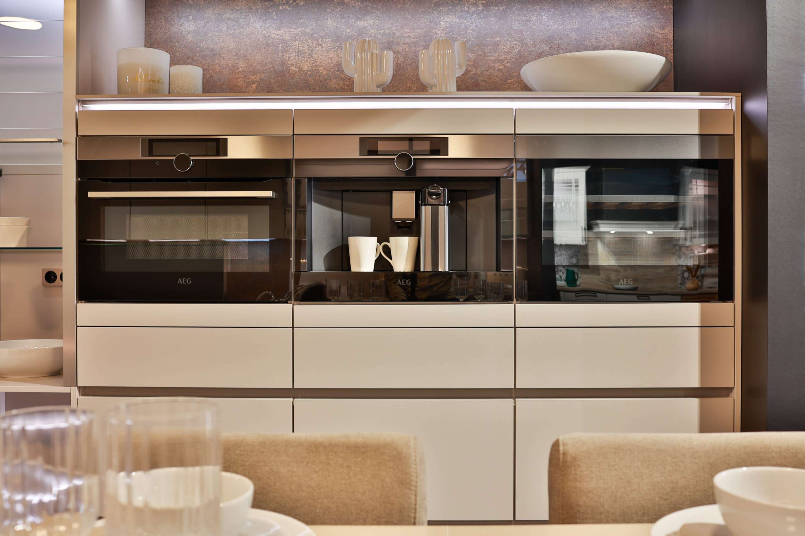
Monochromatic Kitchen
This serene, modern kitchen incorporates three different shades of beige. I am sure we can all feel the warm and inviting ambiance this kitchen exudes.
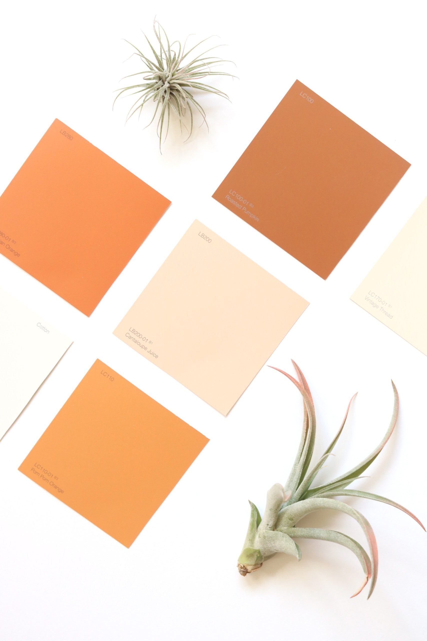
Paint Mass Tone Versus Paint Undertone
A mass tone quite simply is the first color that comes to mind when you are looking at a paint swatch. A color’s undertone can be described as the underlying paint color – something you may not notice on first glance. A paint can have a variety of different undertones such as blue, yellow, purple, green, beige, pink. The undertones present in a paint color will dictate if the paint will look more cool or warm toned. This explains why not every blue paint (or any other paint color) you see will appear exactly the same. Although all blues are categorized as cool colors, if you look at a group of blues comparatively, some hues or shades will appear warmer and others appear cooler.
Cool & Warm Paint Undertones
Have you ever been in a situation where you fall in love with a paint color but after putting all of your furniture back into the space it does not look as good as you hoped? It is possible that you may have forgotten to compare your paint’s undertones to all of the undertones present in the items going back into that room.
Colors that are classified as warm paint colors will have yellow, beige, or pink undertones, and paint colors with blue, green, or purple undertones are classified as cool paint colors.
The less apparent undertones in a paint color can truly create or destroy harmony with the room. For example, if both your custom kitchen cabinets and kitchen flooring have a cool, blue undertone, painting your kitchen beige with warm, red undertone will leave your space looking disjointed and incohesive.
Although it is important to have a balance between both cool and warm tones, it is best to stick to either warm or cool tones for your walls and bigger pieces like furniture. But how do you determine if a paint falls on the cooler or warmer side of the color spectrum? Luckily, there is a simple way to pinpoint a paint’s undertones.
How to Find A Paint’s Undertones
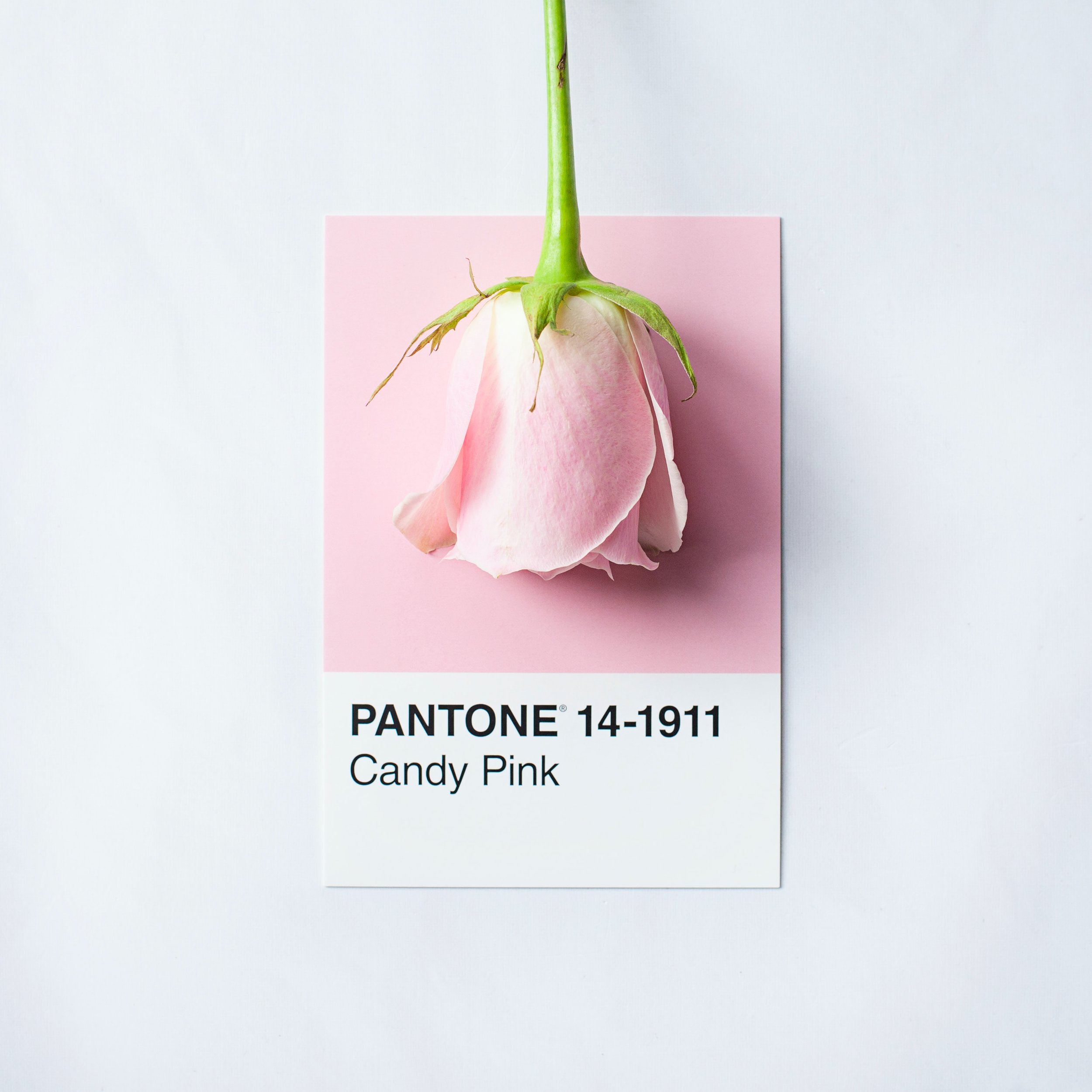
There are a few different methods, but the easiest way to determine a color’s undertones is to lay your paint swatch on top of a piece of computer paper. The contrast between the bright white paper and the paint swatch will make the undertones apparent.
Once you have established if your paint is warm or cool toned, paint a sample board and hold it up to the furniture in that room to verify you correctly identified your paint tones. If you did, the paint should pair well with the undertones of your cabinets, countertops and flooring. Save yourself the effort and be sure to verify that your paint’s undertones will work within your space prior to doing any painting!
Using this paint swatch as an example, when you compare the swatch to the computer paper you can see that this is a cool toned shade of pink.
Lighting Affects How We Perceive Paint Colors
Natural lighting plays an integral role in how paint colors are perceived. If your kitchen is facing north, windows will let in softer light which makes dark paints look even darker, and light paints will appear dimmer. Kitchen windows that are facing south let in more intense light, which makes dark colors appear brighter, and light colors (especially bright white) can wash out the room. West facing kitchen windows bring in warm light at dusk and shadows in the morning, and rooms with east facing windows brighten up the room before noon, but cooler in the evenings.
Artificial lighting also influences the perception of color and can be used to change the color and hues in the kitchen. LED lights in the kitchen will provide warm, natural lighting that makes bright warm toned colors more intense, and cool toned paints slightly duller than how it looks on the paint swatch. However, the most common artificial lighting in a kitchen is fluorescent lights that give off a cool toned light, which pairs best with blues, greens, and greys.