In this blog post we will break down some key interior design principles based on color theory. We hope our examples will help illustrate how colors function before you start the process of painting your kitchen.
What are Complementary Colors in Interior Design?
If you were to look at a color wheel, you would find that every color has a complementary color which appears on the opposite side of the wheel. Complementary colors are also known as contrasting colors and indicate a strong difference between two colors, shades, or tones. While these colors are meant to go together, they match in a bold and dramatic way - such as the colors red and green. Color Theory is a widely used concept in interior design. One important rule to follow when using complementary colors is that they cannot be used in equal amounts in the space, because the two colors will fight for your attention and cancel each other out.
For example, creating a complementary color scheme by painting your walls one color, and then using its complementary color in accent pieces throughout, this kitchen would be considered cohesive, yet eye-catching. However, if you decided on painting your walls a bold color (such as green) and paired it with cabinets in its complementary color (red), your eyes would not know where to look first, clash, and cancel each other out - so it is best to stick to one main color and utilizing the other in accents to avoid making the space look too busy.
In theory, you could create a complementary color scheme with contrasting, bright and bold colors but it is not commonly seen in a modern kitchen. However, you could consider taking a less dramatic approach and use complementary colors like black and white - which is a popular combination in modern kitchen designs. This is easily achievable by choosing bright white cabinets, painting your kitchen a matching white color, and then adding bold accents like a black backsplash, black leather chairs, and a black light fixture.
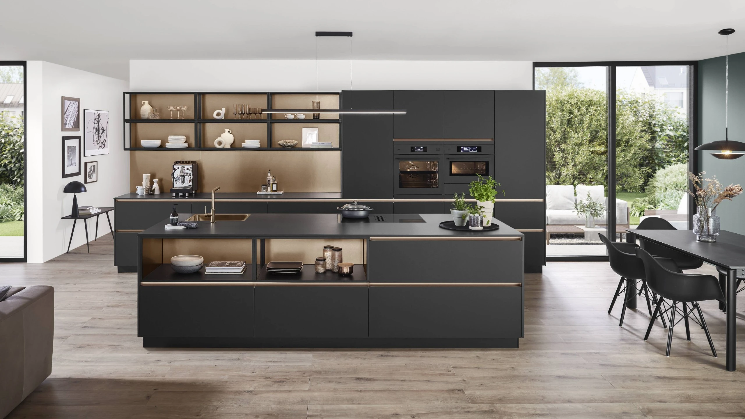
To illustrate this, take a look at this sleek modern kitchen that follows a complementary color scheme and embodies all the elements of a luxurious kitchen.

What are Analogous Colors in Interior Design?
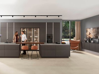
Another concept that is frequently utilized in interior design is analogous colors, which is also derived from Color Theory. On a color wheel analogous colors will appear next to each other such as red, red-orange, and orange. Analogous colors tend to be aesthetically pleasing, and is a less intense approach to color pairing when compared to complementary color pairing. Many designers utilize the 60-30-10 rule - where 60% of your space is a base color (for your walls, and large furniture) , 30% as an accent color (through accent chairs, and area rugs) , and 10% as pops of color (in art pieces or other decorum). We highly suggest that you follow this rule if you are not using a neutral color palette, as this rule will help create synergy between all the colors in a room.
What are Monochromatic Colors in Interior Design?
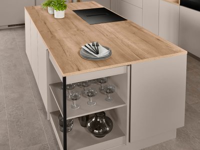
If you are still hesitant to use pops of color throughout the kitchen, a monochromatic color palette is a safe option and extremely common in kitchens! According to Color Theory, a monochromatic color scheme utilizes the same color, but in three different tones or shades. As an example, the modern kitchen below incorporates three different shades of beige which creates a warm and inviting ambiance.

The Difference Between Mass Paint Tones and Paint Undertones:
A mass tone quite simply is the first color that comes to mind when you are looking at a paint swatch. A color's undertone can be described as the underlying paint color - something you may not notice on first glance. A paint can have a variety of different undertones such as blue, yellow, purple, green, beige, pink. The undertones present in a paint color will dictate if the paint will look more cool or warm toned. This explains why not every blue paint (or any other paint color) you see will appear exactly the same. Although all blues are categorized as cool colors, if you look at a group of blues comparatively, some hues or shades will appear warmer and others appear cooler.
Cool, Warm and Neutral Paint Undertones
Have you ever been in a situation where you fall in love with a paint color but after putting all of your furniture back into the space it does not look as good as you hoped? It is possible that you may have forgotten to compare your paint’s undertones to all of the undertones present in the items going back into that room.
Colors that are classified as warm paint colors will have yellow, beige, or pink undertones, and paint colors with blue, green, or purple undertones are classified as cool paint colors.
The less apparent undertones in a paint color can truly create or destroy harmony with the room. For example, if both your custom kitchen cabinets and kitchen flooring have a cool, blue undertone, painting your kitchen beige with warm, red undertone will leave your space looking disjointed and incohesive.
Although it is important to have a balance between both cool and warm tones, it is best to stick to either warm or cool tones for your walls and bigger pieces like furniture. But how do you determine if a paint falls on the cooler or warmer side of the color spectrum? Luckily, there is a simple way to pinpoint a paint’s undertones.
How to Find A Paint’s Undertones
There are a few different methods, but the easiest way to determine a color’s undertones is to lay your paint swatch on top of a piece of computer paper. The contrast between the bright white paper and the paint swatch will make the undertones apparent.
Using this paint swatch as an example, when you compare the swatch to the computer paper you can see that this shade of pink is cool toned.
Once you have established if your paint is warm or cool toned, paint a sample board and hold it up to the furniture in that room to verify you correctly identified your paint tones. If you did, the paint should pair well with the undertones of your cabinets, countertops and flooring. Save yourself the effort and be sure to verify that your paint’s undertones will work within your space prior to doing any painting!
Lighting Effects How Paint Will Appear on the Wall Versus the Swatch
Natural lighting plays an integral role in how paint colors are perceived. If your kitchen is facing north, windows will let in softer light which makes dark paints look even darker, and light paints will appear dimmer. Kitchen windows that are facing south let in more intense light, which makes dark colors appear brighter, and light colors (especially bright white) can wash out the room. West facing kitchen windows bring in warm light at dusk and shadows in the morning, and rooms with east facing windows brighten up the room before noon, but cooler in the evenings.
Artificial lighting also influences the perception of color and can be used to change the color and hues in the kitchen. LED lights in the kitchen will provide warm, natural lighting that makes bright warm toned colors more intense, and cool toned paints slightly duller than how it looks on the paint swatch. However, the most common artificial lighting in a kitchen is fluorescent lights that give off a cool toned light, which pairs best with blues, greens, and greys.
Ensure that you are satisfied with your paint color after taking into consideration how different light sources can change how it will look in your space before painting your kitchen. We recommend painting a large paint swatch and holding it up in your kitchen during different times of the day to see how it appears under different circumstances.
Understanding how to create a cohesive color scheme and ways your space can influence how colors will appear is just the first step in elevating your kitchen. We encourage you to continue browsing our collection of kitchen content for inspiration and ideas to guide you through the entire process of updating your kitchen.